Table of content
The importance and benefits of Human Interface Guidelines
Designing for conversational UIs
UI and UX for Slack
Creativity from constraints
5 design principles for /commands
Intuitiveness
Consistency
Structure
Context
Conversational syntax
User on-boarding
Help command(s)
App discovery flow
Leveraging Slack UI
The importance and benefits of Human Interface Guidelines
When Apple launched the iOS platform in 2007, designing iPhone apps was something completely new for everyone, including of course myself. I also had no experience at all designing graphic user interfaces and in general consumer products (my background was enterprise). The enthusiasm for a platform that I knew would have changed our lives was very motivational, but where to start?
Apple has a brilliant “tool” called Human Interface Guidelines (HIG), a document which offers developers a set of recommendations on how to design apps for any of their platforms. It’s brilliant for two major reasons. First, it allows literally anyone to easily get started, in my case, with mobile design. Second, it helps deliver a consistent experience for the users of the platform, instantly making it more “user friendly” for a simple reason: all the apps behave in the same way.
Consistency in the interface allows people to transfer their knowledge and skills from one application to another. A consistent application is not a slavish copy of other applications. Rather, it is an application that takes advantage of the standards and paradigms people are comfortable with.
Just by reading that document, I was magically able to design consumer mobile apps. My first app, developed with my friends in our spare time, reached and held for over two years the Top 10 for Social Networking, got featured by Apple as “All-Time Top Paid app” and “Top 10 best Social Networking app” and drew the attention of Samsung and Microsoft interested in having it ported to their operating systems.
Designing for conversational UIs
Recently, I started designing conversational UIs, not because of the current hype (it was way before that), but simply because I believed it was the best interface for the product I was working on. With my team, we started developing Kyber for iOS, the first conversational productivity app, that included bots and more importantly our own “emoji-based” contextual messaging. When the Slack platform was publicly launched, it was a no brainer to bring the same layer of productivity from Kyber on top of the Slack messaging platform.
The design process was different than in 2007 though: I didn’t have any “HIG for conversational UIs” to refer to. Therefore, my team and I decided to early release beta versions of both iOS and Slack apps and figure out ourselves the best way to design for these new interfaces. This approach allowed us to collect a lot of UX data, quickly iterate and learn a lot on how users interact with these new kind of apps.
Now, stimulated by a meetup organized by Slack (my session starts at minute 15), I decided to put together the “HIG for Slack” a document that shares those data-driven learnings: hopefully it will help other developers to get started in an easier way and Slack users to enjoy a consistent experience. The guidelines collected in this document can be applied to any other messaging platform relying on commands or more generically presenting a conversational UI (e.g. Telegram, Hipchat, Kik, Facebook messenger, etc)
As in the Apple HIG, a lot of examples will be presented here to better illustrate the design theory. The examples are taken from the experience with the app we developed, as this HIG is the result of that work. To give you some context, let’s briefly describe Kyber.
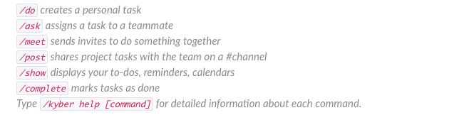
Kyber is a native Slack app that allows you to:
- manage your personal to-dos, reminders, calendars in a single, unified view (personal productivity)
- assign and track tasks to teammates (delegation)
- schedule meetings (calendaring)
- collaborate on projects shared on channels (project management)
Despite its complexity, the app is fully contained in Slack (i.e. you don’t have to leave Slack to perform all those functionalities) and relies on /commands to interface with users. Kyber for Slack is currently the #1 app in Office Management and among the Top 10 apps in both Productivity and Project Management categories on Slack App Store.
UI and UX for Slack
Let’s start by making a simple distinction on a design topic which is very confusing in general: UI vs. UX.
On Slack, this is your UI:
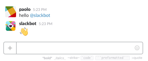
Some text, some formatting, at best some emojis. That’s it.
What about your UX then? To keep things very simple and helpful for design purposes, your UX is a conversation.
No buttons, no gradients, no animations, no gestures. Just text and conversations. Very limited, with a lot of constraints.
Creativity from constraints
Before you stop reading and give up on conversational UIs, let’s look at what Leonardo da Vinci had to say:
Art lives from constraints and dies from freedom
Leonardo da Vinci
Right because of the constraints, designing for conversational UIs is actually a very interesting exercise and many of the learnings from such a limited interface can then be applied back to “regular” user interfaces, simplifying them even more.
But the question still remains: with so many constraints, how effective are products built for conversational UIs? How complex business apps can be “translated” into few Slack commands? Is that even possible?
Ernest Hemingway once allegedly challenged his writer friends to write a novel with just… six words. Everybody laughed at him, until he showed the following text:
For sale: baby shoes, never worn
In just six words at least two characters are introduced, along with their story, its drama and pathos. All in six words.
If a novel can be told in six words, I’m here to postulate that building Slack apps, even complex, can be done and with just few commands.
It’s not easy, of course, but in the case of Kyber, a pretty complex app, we have been able to tell our “productivity story” with only six commands. As a consequence of this work, I came up with five design principles for /commands you can apply to your new Slack app.
5 design principles for /commands
Intuitiveness
Individual commands need to be intuitive, or else they won’t be remembered (and, as a result, your app won’t be used). Therefore, when picking command names, be memorable by clearly conveying the action the user will be able to perform. Be very thoughtful. Remember, this is your interface with your users: as we spent (too much) time choosing the right font or the right gradient for that button, now we need to spend the right amount of time on command names.
As a rule of thumb use verbs for user actions and use nouns for settings/states. See regular Slack commands as a reference:
Actions: /invite, /leave, /mute, /collapse, /expand
Settings/States: /prefs, /away, /shortcuts, /who
Lastly, when deciding on a command name, remember the platform you are developing for. Slack is a product of its kind. Their mission says:
Slack is on a mission to make your working life simpler, more pleasant and more productive
So be pleasant, be Slack-y.
As an example, to delegate a task to another user on Kyber, we looked at a variety of options (i.e. verbs). We could have easily used /assign, the common terminology in project management. But assign didn’t sound so Slack-y: it’s too “strong”, it’s too “serious”. We then looked at /tell (e.g. /tell @user to do this). It was more conversational, certainly “nicer” than assign, but still had a somehow “bossy” connotation. We ended up choosing /ask, a verb that expresses the request to do something for you, but it’s more “neutral” and more pleasant than the previous options.
Consistency
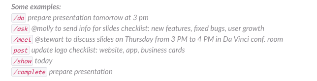
One way to have user friendly commands is to keep them as consistent as possible. As you can see below, all the commands we designed for Kyber follow a very consistent and repetitive structure:
/do [what], [when], [where], [checklist:]
/ask @user to [what], [when], [where], [checklist:]
/meet @user to [what], [when], [where], [checklist:]
/post [what], [when], [where], [checklist:]
It didn’t happen by chance: we did spend a lot of time to come up with such an organized structure, as many were the options and permutations available.
One easy way to verify the consistency of your commands is to write them down, along with their parameters, in a table: if you see a common pattern, you might have found the right solution, if not continue to iterate. Of course it won’t be possible to maintain such consistency for all, and exception – as long as reasonable, intuitive and coherent – are certainly acceptable.
Structure
First we discussed how to design commands individually; then how to make commands consistent as a set. The next step is to understand if and how we can make commands work together instead of creating yet another one. Why is this important?
Perfection is achieved not when there is nothing more to add, but when there is nothing left to take away
Antoine de Saint-Exupery
It’s true you can always add one new command. But too many commands can make the interaction with your app more difficult, as they become difficult to remember and likely to convey nuances. Therefore, try to find a way to re-use existing commands by linking them together in an organized structure.
On Kyber, we have a command, /post, that enables project management functionalities on each Slack channel. Tasks are posted for anyone to see and interact with, in the context of the conversations happening on a channel. Such shared tasks might not be assigned at creation: I can find the issue, but I might not know who is responsible to fix it. Instead of creating yet another command, we decided to find a way to link our existing commands, /do and /ask, to /post.
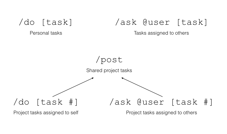
Every time a task is created with /post, a number is assigned to it; /do and /ask can reference to that number to assign the task to self or to a teammate. By creating the above structure where commands interact with each other, we avoided to add a new command and we re-enforced the value and the meaning of the existing ones.
Context
One way to make commands simpler and faster to use is to leverage the context of where the command is executed. Instead of requiring to enter each time certain parameters, context allows to imply them and modify the default behavior of a command.
Sending a message can be considered the result of a contextual /msg command, always omitted being messaging the main functionality: if you type a message in the context of a direct message to a user, that text will be delivered only to that user; if instead you are in the context of a channel, your message will be delivered to everyone in that channel. In other words, the same command behaves differently based on the context. But, if you are in a channel, and want to “override” that context and send a private message, you have to specify @user as a parameter (/msg @user) to send it; same if you want to send a message to channel from a direct message with a user (/msg #channel).
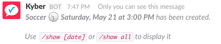
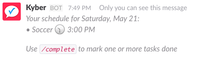
In Kyber’s case, we used a similar approach. To display personal tasks for today, we have /show today, while for project tasks discussed in #channel we have /show #channel . When /show is entered with no parameters, we use context to imply the parameter.
In a channel, we directly show the project tasks:
If /show is executed anywhere else, personal tasks for today are instead displayed:

Of course, /show today or /show #channel override that context and always return the expected result.
Conversational syntax
This is probably the most interesting design principle for a command. Slack commands are historically inherited from one of the very first mean of interaction with computer systems, developed back in the 60’s: the Command Line Interface (CLI). Commands were the “language” used by humans to talk to computers; mainly developers and scientists had access to computers and they were comfortable with the highly rigid structure and rules that commands required to enable that communication. Only with the introduction of a more intuitive Graphical User Interface (GUI) personal computers went mainstream.
Commands today still somehow retain that “stigma” of being not so consumer friendly – but it doesn’t have to be that way.
If Slack is all about conversations, why not making the commands conversational as well? Instead of requiring a rigid sequence of parameters (who, what, when, where) following a specific syntax, we decided to apply natural language processing (NLP) to parse Kyber commands. Now, users simply need to remember the semantics of our commands and just write, as they speak, a natural sentence to set a reminder, create a calendar event, add a location, assign a task or meet someone. With our NLP, even complex interactions are truly intuitive and easy to execute.
Therefore, make your command more conversational with the use of NLP and less dependent from a fixed syntax. Then use your app bot to “respond”, as in a conversation, to that command: as a first basic interaction, show what the bot has “understood” from the command and what it has done with it. This will give your user the confidence that your bot is working properly and is able to “converse” with her.
User on-boarding
One of the biggest problem with conversational UIs is that… there is no UI. Users don’t know which commands are available and what they can do with your app. I’ll recommend two ways to drive the discovery of your app.
Help command(s)
The first option you have available to introduce your app’s commands is to offer an help command. How to structure this help though? Should it be a single, comprehensive help or should it be broken down in multiple help commands?
Unless the app is basic, I recommend to have a hierarchy of help commands: a single top level “app help” along with specific “command helps”. In other words, don’t start describing every little detail of each commands in the first help you present; rather, start by explaining how the app will benefit your user and then offer a description of the app purpose.
This is how we achieve the “benefit – purpose” model in the first two sentences of Kyber’s help:

The next step is to describe the syntax of your commands, again at a very high level:
![]()
In that one sentence, we suggest how to enter our NLP-based commands (“Type your tasks as normal sentences”) and we hint about “advanced” features (“add recipients, time, location, checklist”), showing again flexibility of our conversational commands (“as needed”).
Continue with the semantics of each command, referring to individual help commands for specific syntax and other details. Semantics – instead of detailed syntax – will help make the commands memorable and feel intuitive (first design principle we discussed):
Finish your help with some examples. Examples are extremely powerful. They are the simplest to understand and easiest to assimilate by a user. They also allows you to showcase more features without having to pedantically explain them.
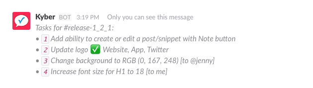
In our examples, we show how to create a reminder, how to add a checklist, how to create a calendar entry or a location, increasing the complexity of the command at each step:
In summary this is a good structure for a top level app help:
- Describe the benefit and the purpose of your app
- Show the high level syntax of your commands, without going into details
- List the actual commands along with their semantics
- Use examples to showcase various features
In the specific command helps (/kyber help [command] or /[command] help), make sure you repeat the basic concepts already presented in the app help to reinforce them (repetita iuvant, said Latins); then add the detailed information for the particular command. Also here, add examples, from the simplest to the most complex.
App discovery flow
Even if you provided the best structured, easiest to assimilate help, you have to assume that nobody will read it; even those who read it, likely won’t remember all the details and will still need additional help while navigating an app that has no navigation UI. Because of that, I came up with a second option to improve app usability: the App Discovery Flow (ADF). ADF consists in building various “paths” to take the user through a “day-in-a-life” of the key element of your app – in Kyber’s case a task – showing at each step, the next.
Let’s see an example. User first creates a personal task with /do.

The bot responds to confirm the parsing of the command and adds an inline help to take the user to the next step. In our case, after having created a task, we want the user to discover the timelist, our unique combination of to-dos, reminders and calendars; therefore we suggest to enter /show [date]. This way the user now discovers a new command, and just by using the app, learns the “hidden” navigation.
Next, at the end of the /show command output, we indicate to use the /complete command to mark one or more tasks as done.
Using the ADF methodology, we are able to show to the user the entire life cycle of a task and the commands involved to go through it.
Leveraging Slack UI
At the very beginning of this HIG we talked about UI. Even if limited compared to a graphical UIs, there are quite some text formatting options that can be leveraged.
These guidelines can help you decide which ones to apply your content:
- Use *bold* to drive attention to key content
- Use _italics_ to distinguish between messages and help
- Use `code` for commands
See an example here:
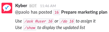
Prepare marketing plan is the task name and as such is in bold. The ADF help we discussed before is in italics, while the commands are using `code`. A consistent and structured approach like this allows users to easily and quickly parse any of the interactions with your app.
Depending on the app, you can also use ~Strikethrough~, “`preformatted“` or >quote. For example, we use strikethrough for completed tasks, or preformatted to nicely present the morning agenda.